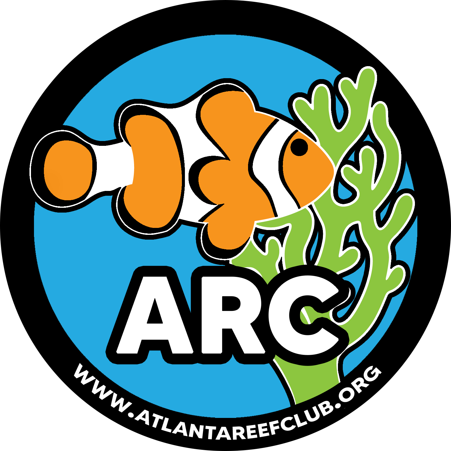
ARC Brand Design Opinions Welcome!

FutureInterest

Well-Known Member
Market
Messages
4,441
Reaction score
1,330
Looking for some opinions on a new logo and branding. Thank you @bzb Bobby for putting this together for us :). We have so many amazing people in this club donating their time and talents!
 

Attachments

  • ARC Brand Design - Concept Proposals.pdf
    1.4 MB · Views: 151
Thank you Bobby. You do good work!

As for this logo, it seems like an alright option; but I’m not sold on it. the coin definitely looks better than the patch, in my opinion. I’d be interested in seeing a few other unique logo designs.

The current mascot is a blonde Naso. As opposed to creating a new brand/mascot, I’d also like to see an attempt to update this. I love clowns, but that’s everybody’s logo these days, and is an opportunity to differentiate ourselves... perhaps by just updating what we already have.
 
Last edited:
  • Like
Reactions: bzb
And the softer edges are nice. Given that we are a non-profit that may be looking to expand our impacts, I think the softer edges and features are all a great call!

I like having a fish as a mascot. They are more personable than coral, and are a valuable part of the reef. However, the variety of shapes of corals provide lots of room for flexibility with design options. For example, you could use the negative space between coral branches to shape a human hand as a representation of our efforts to help the reefs of the world.
 
Totally awesome! Great job @bzb !!! Totally want to get some stickers :)! and t-shirts..... with the new logo :).

I can certainly help with any of that production once a design is settled on :)

Thank you Bobby. You do good work!

As for this logo, it seems like an alright option; but I’m not sold on it. the coin definitely looks better than the patch, in my opinion. I’d be interested in seeing a few other unique logo designs.

The current mascot is a blonde Naso. As opposed to creating a new brand/mascot, I’d also like to see an attempt to update this. I love clowns, but that’s everybody’s logo these days, and is an opportunity to differentiate ourselves... perhaps by just updating what we already have.

Appreciate the detailed feedback! I’m not completely happy with any of the concepts, but that’s exactly what they are... concepts! I did attempt a couple concepts with a tang, but kept running into the same issues:

- Tangs are fairly nondescript, generic “fish” shape, which is good and bad.
- On the negative side, they don’t have a whole lot of design to them that makes for a good silhouette/flat design.
- Once placed... it kind of reminded me of more “fishing” logos, rather than “aquarist” or “reef keeper”, if that makes any sense.

I can certainly play with the ideas some more. This week is busy for me, but I’ll be off quite a bit for the holidays and can certainly do some live updates, if necessary.

I'll throw a few together tomorrow .

Definitely interested to see what you come up with!!
 
- Tangs are fairly nondescript, generic “fish” shape, which is good and bad.
- On the negative side, they don’t have a whole lot of design to them that makes for a good silhouette/flat design.
- Once placed... it kind of reminded me of more “fishing” logos, rather than “aquarist” or “reef keeper”, if that makes any sense.

Yeah, that makes a lot of sense. I thought about some of those same issues when imagining how I would do it. Definitely poses a challenge.

over the holidays, I’ll also try to draft up some crude concepts as well.

But great work so far!
 
Just wish they had XXL size ;'-( I was only able to get an XL:confused:

I've got a pretty extensive network of vendors across the country. Very good screen printer here locally in Suwanee, too. I have no issues managing merch runs, and will include up to 4XL sizing, as well as tall options for our friends over 6'2".

Unless they like the vintage Britney Spears look, of course. No judgement.
 
all good designs but i need to go against Concept 3: badge on page 6.

it looks similar to the design of one of our sponsors (initials PA) and i don't want any complications that may arise.

i'm very fond of concept 2: patch with the the green coral. it contrasts nicely with the blue background and the clownfish
 
I do graphic design and have gear for it I can make sum ideas and show you guys and I also do custom clothes just let me know what you guys want do you guys want short sleeve or long will anyone donate any shirts etc but I’m down to do it but the customs are a little bit of work unless you guys want just a virtual design to get them pressed on shirts
 
I notice that we put one of the new “coin” designs on the forum. While I think the new design looks sharp on its own, I still think it’s taking a big step in the wrong direction in terms of being our new logo. That is, unless the intent is not to improve our logo, but rather to re-vamp our logo and brand entirely; which would then be followed by trying to improve upon this new logo.

Another downside to the coin logo is that the text unreadable on mobile.

It’s my impression that the goal is to improve the logo. This may or may not include revamping our brand, but I’m holding out for something more.

I’ll try to draft up some first-draft designs today.
 
The current logo sucks, so this is great.

I've always like the stamp/badge look. I'm a big fan of that more vintage style; I think it looks super cool and really opens up the design possibilities. Especially if you can use an old timey fish depiction.
 
Back
Top