T-Shirt Design Contest!

Status
Not open for further replies.
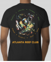
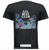
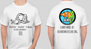
See what people think about this idea that I have refined throughout the day today. The Atlanta Reef Club wording would be in the correct font, this is just a concept. ARC logo on the front. The octopus image can all be licensed for up to 300 shirts. The other images I will need to check on, but I don't expect issues if there is one that is preferred over others. I'm partial to each of these for different reasons.

View attachment 66148
I have no artistic ability to use here but I really like the Octopus myself and think the Preserve, Promote and Educate is a great add.

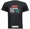
The instructions said to use the original logo as well shown below. Can we maybe splash the colors like the octopus as well?? think that color splash looks cool.
ARC_Logo_Circle_2022v2.jpg
 
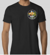
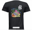
This is my final latest version taking thread feedback into consideration. To help tie the octopus to the club, this design has room for 8 descriptive words, I have chosen 8 to start, there may be a few others that are more appropriate. The front logo has the octopus colors in the background @DiefsReef. The shirt color could be black or gray.

1666756493991.png1666756623177.png
 
Last edited:
This is my final version taking thread feedback into consideration. To help tie the octopus to the club, this design has room for 8 descriptive words, I have chosen 8 to start, there may be a few others that are more appropriate. The front logo has the octopus colors in the background @DiefsReef. The shirt color could be black or gray.

View attachment 66653View attachment 66654
I love it! The only thing that looks out of place to me is the Red Atlanta Reef Club. Possible to maybe use splash colors for the lettering as well or does the font have to be one color?
 
I love it! The only thing that looks out of place to me is the Red Atlanta Reef Club. Possible to maybe use splash colors for the lettering as well or does the font have to be one color?
This shirt would have to be 4 color process plus white, so the text can be any color.
 
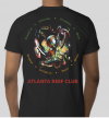
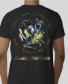
This is the challenge with trying to use the octopus coloration within the ARC text, it's not very readable in my opinion. Outlining it help somewhat. I think the ARC orange text is an improvement over the red that was left over from a previous iteration. Also, I'm not a fan of altering existing logos that represent a brand like our ARC logo. However, it does look more cohesive with the back when treated that way.

1666821719392.png1666821864653.png
 
This is the challenge with trying to use the octopus coloration within the ARC text, it's not very readable in my opinion. Outlining it help somewhat. I think the ARC orange text is an improvement over the red that was left over from a previous iteration. Also, I'm not a fan of altering existing logos that represent a brand like our ARC logo. However, it does look more cohesive with the back when treated that way.

View attachment 66666View attachment 66667
I like it with the splash color myself (draws you in to have a closer look) but either looks good to me
 
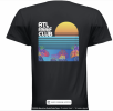
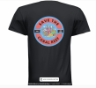
I think rainblood or trizzino won this with the pic of the mandarin and save the reef. Or if trizzino dont mind rainblood stealing the term under the mandarin saiving the reef. Or just maybe they can split the pot
 
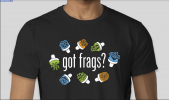
The "got frags" design with the club logo on the back is the most production ready out of all so far and it looks great also.
 
New design number 2, eels are one of my favorite things to draw so I thought I'd integrate one. let me know if the punnish mispellings aren't clear enough.ARCshirt2.png
 
Status
Not open for further replies.
Back
Top