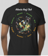
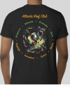
Nothing concrete at this point but the plan is to have them printed in time for the xmas meeting. Seems like plenty of time but we have to factor in holidays, down time, hiccups, etc
If you have more ideas - I would push them out sooner rather than later
If you have more ideas - I would push them out sooner rather than later